Fine Art Photography Blog
Photographic Composition 5 - Frame Edges & Visual Separation

Click to view full image
17/02/2012
This is the fifth and final article in my series on the subject of photographic composition.
This is the concluding article of my five part series on the subject of photographic composition.
So far in the series we've looked in articles 1 and 2 at the issues that I personally feel are the most important in my own photography - those of 'simplicity' and 'balance'.
We then moved on in articles 4 and 5 to look at the importance of 'emotion' and 'light & form' and the ways in which they can influence compositional choices.
This final article on 'frame edges' and 'visual separation' will be shorter than the others as these two final issues are simply a couple of things to be careful about when composing your photos.
'Frame Edges'
The one thing all photos have in common is that they all have frame edges and the way in which the subject of your photo interacts with these edges is a really important issue, yet it's one that many beginners seem to have problems with.
The biggest problem with frame edges that I see all the time is photos that have been composed with the subject too close to, or just touching the frame edge.
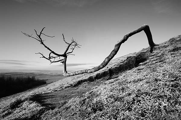
In order to show you what I mean I've re-cropped the photo of the tree from the introduction to this article so that the branches are just touching the edges - can you see how this creates a visual tension that detroys any sense of serenity in the original image.

key [9153030 ] doesn't exist
.
Tip - when I'm looking through the viewfinder in my camera at a scene that I want to photograph the last thing that I do before pressing the shutter button is to consciously run my eye along all four edges of the frame to make sure that I haven't got any stray bits of scenery sticking just into the shot and to make sure that I'm happy with the frame edges.
Obviously there are no rules when it comes to photographic composition and it's quite possible, for example, that you may want to deliberately create visual tension in a particular shot and so you may place the subject very close to the frame edge for that reason - in fact 'street' photographers often do this very successfully but the key thing to remember is that it's being done for a reason and that it's been a positive decision on the part of the photographer.
Personally speaking, with my own landscape and architectural photography, I usually leave plenty of space between the subject of my photo and the frame edges or I'll deliberately crop in close - anything to avoid something that looks like it's happened by accident!
'Visual Separation'
This is an even simpler issue than the one of 'frame edges' yet it's another one where beginners to photography frequently come unstuck.
Simply put, we have two eyes so we see the world in three dimensions but, as photographers, when we then lift our camera up to one eye to take a photo, the resulting photo is in two dimensions.
As a result, you need to make a conscious effort to think about the way you are composing the differing elements that make up your photo to make sure that they don't visually merge into one another in your photo.
When composing for black and white photography it is even more important than with colour that you consider this issue.
The photo below is a good example - it was taken on the same visit as the photo at the top of the page.
You'll notice that it is not as successful an image as the other photo and the main reason is that the tree is very low to the ground and, even though I tried my hardest, I couldn't achieve a visual separation in the image between the trunk of the tree and the ground.
In b&w the tones of the two elements are very similar and they so they tend to blend into each other. As a result the overall image loses a lot of it's clarity and impact.
My ambition is to try and return to this spot afer it's been snowing when hopefully the dark tree trunk will stand out better against the snow covered ground.

[link type="photo" id="9153029"][/link]
.
This concludes this five part series of blog articles describing my personal approach to composition.
I still remember vividly how deeply frustrated I used to get with my own photography when I was a beginner. My hope in writing these articles is that you may find something in them that will help you to overcome any frustrations you may have experinced with composition so that you can better enjoy your own photography.
.
If have any comments or queries please send me a note using the form at the bottom of the page.
Ian Bramham
17th February 2012.
.
Comment
22.02.2012
Thanks Ian for excellent post on visual separation and frame
edges. I love your photo of this lonely tree. You have explained very
well the importance of visual separation by giving example of tree
blending with ground due to similar tones. You way of explanation is
very simple and effective. I regularly check your website and your
aminus3 blog for more photos/blog. Thanks again..
-Dhaval
Reply
Hi Dhaval, thanks very much for taking the time to let me know you found the article useful. It makes all the difference to know that it's been worth the effort of writing down my thoughts on these issues relating to composition.
Ian
Comment
17.07.2012
Great article on space; I do think that the use of space is often ignored as a composition aid and I'm glad that you wrote this wonder article about it!
Hans ter Horst
Reply
Thanks Hans!
So far in the series we've looked in articles 1 and 2 at the issues that I personally feel are the most important in my own photography - those of 'simplicity' and 'balance'.
We then moved on in articles 4 and 5 to look at the importance of 'emotion' and 'light & form' and the ways in which they can influence compositional choices.
This final article on 'frame edges' and 'visual separation' will be shorter than the others as these two final issues are simply a couple of things to be careful about when composing your photos.
'Frame Edges'
The one thing all photos have in common is that they all have frame edges and the way in which the subject of your photo interacts with these edges is a really important issue, yet it's one that many beginners seem to have problems with.
The biggest problem with frame edges that I see all the time is photos that have been composed with the subject too close to, or just touching the frame edge.
In order to show you what I mean I've re-cropped the photo of the tree from the introduction to this article so that the branches are just touching the edges - can you see how this creates a visual tension that detroys any sense of serenity in the original image.

key [9153030 ] doesn't exist
.
Tip - when I'm looking through the viewfinder in my camera at a scene that I want to photograph the last thing that I do before pressing the shutter button is to consciously run my eye along all four edges of the frame to make sure that I haven't got any stray bits of scenery sticking just into the shot and to make sure that I'm happy with the frame edges.
Obviously there are no rules when it comes to photographic composition and it's quite possible, for example, that you may want to deliberately create visual tension in a particular shot and so you may place the subject very close to the frame edge for that reason - in fact 'street' photographers often do this very successfully but the key thing to remember is that it's being done for a reason and that it's been a positive decision on the part of the photographer.
Personally speaking, with my own landscape and architectural photography, I usually leave plenty of space between the subject of my photo and the frame edges or I'll deliberately crop in close - anything to avoid something that looks like it's happened by accident!
'Visual Separation'
This is an even simpler issue than the one of 'frame edges' yet it's another one where beginners to photography frequently come unstuck.
Simply put, we have two eyes so we see the world in three dimensions but, as photographers, when we then lift our camera up to one eye to take a photo, the resulting photo is in two dimensions.
As a result, you need to make a conscious effort to think about the way you are composing the differing elements that make up your photo to make sure that they don't visually merge into one another in your photo.
When composing for black and white photography it is even more important than with colour that you consider this issue.
The photo below is a good example - it was taken on the same visit as the photo at the top of the page.
You'll notice that it is not as successful an image as the other photo and the main reason is that the tree is very low to the ground and, even though I tried my hardest, I couldn't achieve a visual separation in the image between the trunk of the tree and the ground.
In b&w the tones of the two elements are very similar and they so they tend to blend into each other. As a result the overall image loses a lot of it's clarity and impact.
My ambition is to try and return to this spot afer it's been snowing when hopefully the dark tree trunk will stand out better against the snow covered ground.

[link type="photo" id="9153029"][/link]
.
This concludes this five part series of blog articles describing my personal approach to composition.
I still remember vividly how deeply frustrated I used to get with my own photography when I was a beginner. My hope in writing these articles is that you may find something in them that will help you to overcome any frustrations you may have experinced with composition so that you can better enjoy your own photography.
.
If have any comments or queries please send me a note using the form at the bottom of the page.
Ian Bramham
17th February 2012.
.
Comment
22.02.2012
Thanks Ian for excellent post on visual separation and frame
edges. I love your photo of this lonely tree. You have explained very
well the importance of visual separation by giving example of tree
blending with ground due to similar tones. You way of explanation is
very simple and effective. I regularly check your website and your
aminus3 blog for more photos/blog. Thanks again..
-Dhaval
Reply
Hi Dhaval, thanks very much for taking the time to let me know you found the article useful. It makes all the difference to know that it's been worth the effort of writing down my thoughts on these issues relating to composition.
Ian
Comment
17.07.2012
Great article on space; I do think that the use of space is often ignored as a composition aid and I'm glad that you wrote this wonder article about it!
Hans ter Horst
Reply
Thanks Hans!


